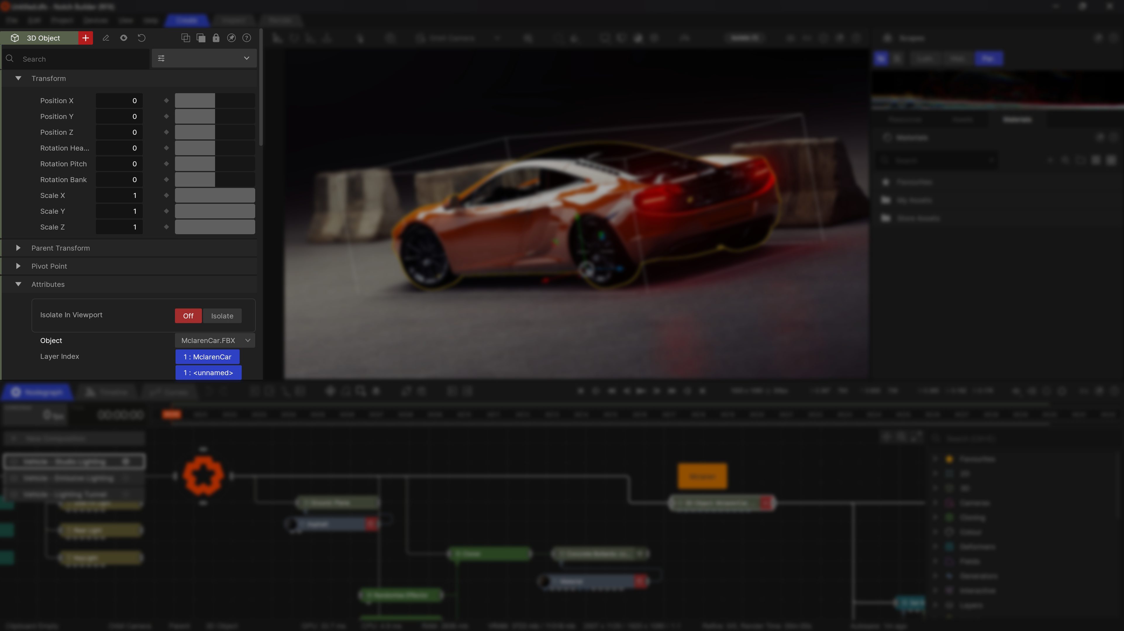
Properties
Updated: 28 Mar 2026
Updated: 28 Mar 2026

This window lists all of the editable properties for a node. From here they can be modified, keyed, or exposed for use by other tools.
A node must be selected to see the properties in the property editor.
| Icon | Label | Description |
|---|---|---|
| Rename Node | Rename the currently selected node | |
| Toggle Node Active | Control whether the node is active in the scene. When disabled, the node doesn’t contribute to the scenes performance. | |
| Reset Node Properties | Resets all the properties on the node, bringing it back to its default state. | |
| Copy All Properties | Copies all the properties of the node, so they can easily be pasted onto another node of the same type. | |
| Paste All Properties | Pastes all the properties of the last copied node if it is of the same type. | |
| Lock Properties | Lock all properties so they can’t be edited. | |
| Undock | Undock the property editor to place it somewhere else. for more, see our User Interface page. | |
| Help | Takes you to the manual page on the Property Editor. Perhaps that’s how you got here? | |
| Search | Filter the property list to find a specific parameter | |
| Presets | See Presets |
Presets allow you to save certain effect setups to be re-used again and again. These are saved to the Documents\\Notch\\Notch Presets folder.
| Icon | Label | Description |
|---|---|---|
| Add Preset | Save the current property values as a preset. | |
| Edit Preset | TBD | |
| Delete | TBD |
Properties come in various types, from checkboxes and buttons to text entry and sliders.
Most property types can be exposed, or linked to by a Property Node for control from external sources.
| Icon | Label | Description |
|---|---|---|
| Reset | Reset the property to its default state | |
| Lock | Lock a property so it can’t be edited. | |
| Keyframe | Add a keyframe to the current property. For more on key framing, see our page on the Timeline and Curve Editor | |
| Chevron | Access to exposing and some unique property options. For more on exposing parameters, see our page on Exposed Parameters |
Notch has various different kinds of properties for changing the properties in a node.
| Label | Description |
|---|---|
| Float Slider | Control the value of a property by simply clicking and dragging within the slider range. This is the most common property type in Notch. |
| Int Slider | Similar to float sliders, these allow you to control the value of a property by simply clicking and dragging within the slider range, but limited to whole numbers. |
| Radio Button | Choose one option from a range of options. Generally used for selecting modes or other distinct behaviours within a node. |
| Multi-Select | Select multiple options from a range of options. Generally used to control where something can be applied, such as R/G/B/A or X/Y/Z. |
| Dropdown | Choose one option from a large list of options. Generally used for selecting resources from the resource list on a node such as the Video Loader, or 3D Object. |
| Checkbox | Simply enables or disables a feature within a property. |
| Colour | See Colour. |
| Coefficients Graph | Allows you to control how an effect applies to particles over time. Exclusive to particles. |
| Gradient | See Gradient |
Sliders can have greater control by using modifier keys.
Shift, to move with snapped values based on the min/max of the slider.Ctrl, to move precisely, with movement ten times slower than normal.Alt, to move outside of the current ranges.
Most sliders can be controlled by Modifier Nodes by dragging the output of the modifier onto the node in the property editor. for more on using modifiers, see our page on Modifiers.

Colour properties allow you to control the colour of certain attributes of a node. By clicking on this property, you can expand it to access more properties, and interact with the colour wheel.
Colour properties have 5 different ways to adjust their colour:
| Icon | Label | Description |
|---|---|---|
| Colour Selector | Select a colour from a colour palette. | |
| Add to Palette | Add the selected colour to the colour palette. |

Colour gradients allow you to control how a colour changes over a value range. The value range will depend on where it is used, such as the Particle Life in the Life Colour Shading, or the start and end colours in a Gradient Generator.
By double clicking in the colour range, you can add or remove colours on the gradient. You can also drag the colours in the gradient to control where the colours blend in more precisely.